Pyramid will automatically select the most appropriate visualization for the data in your NLQ question using its AI driven Smart Visualization engine. You can also specify a visualization type by adding it to your question to override the automatic choices made for you.
Natural Language Querying does not support custom visualizations.
Visualization Picker
By default, all NLQs are resolved by drawing the resulting data into a visual that best suites the data selected. This process uses an AI driven heuristic that takes numerous factors into account when drawing data, as described in more detail here.
The engine takes into account the measures and number of measures requested; the number of hierarchies and types of hierarchies requested; the size of the data set that will be generated as well as data types (like time, geospatial, Proper nouns) and any filtering and sorting used.
Sometimes, the automated result is not what the user is after. So the user can also manually specify the visualization they want to see within the question text and the NLQ question will return the specified visualization - however, the LAYOUT of the data elements will still be automatically handled by the Smart Visualization engine.
To override the LAYOUT (and for more granular control of the selections), the user should open the resulting Discover reports using Discover Lite or Discover Pro if they have access to these tools.
Overriding the Visual
To change the selected visual, the user needs to use the plain English description for that visual in their text. This simply means appending the visual name like "grid"; "pie"; "column chart"; "line chart"; "bar chart"; "area chart" etc.
Chat Bot
The Chat Bot does not change the selected visualization automatically. Instead it will draw the results of the changes using the currently selected visual, unless a new chat session is triggered. However, if the Bot is asked to change the visual (like above), it will switch it.
Override Examples
Asking "show sales by promotion and gender" (using the sample database) will automatically draw the following result on screen:
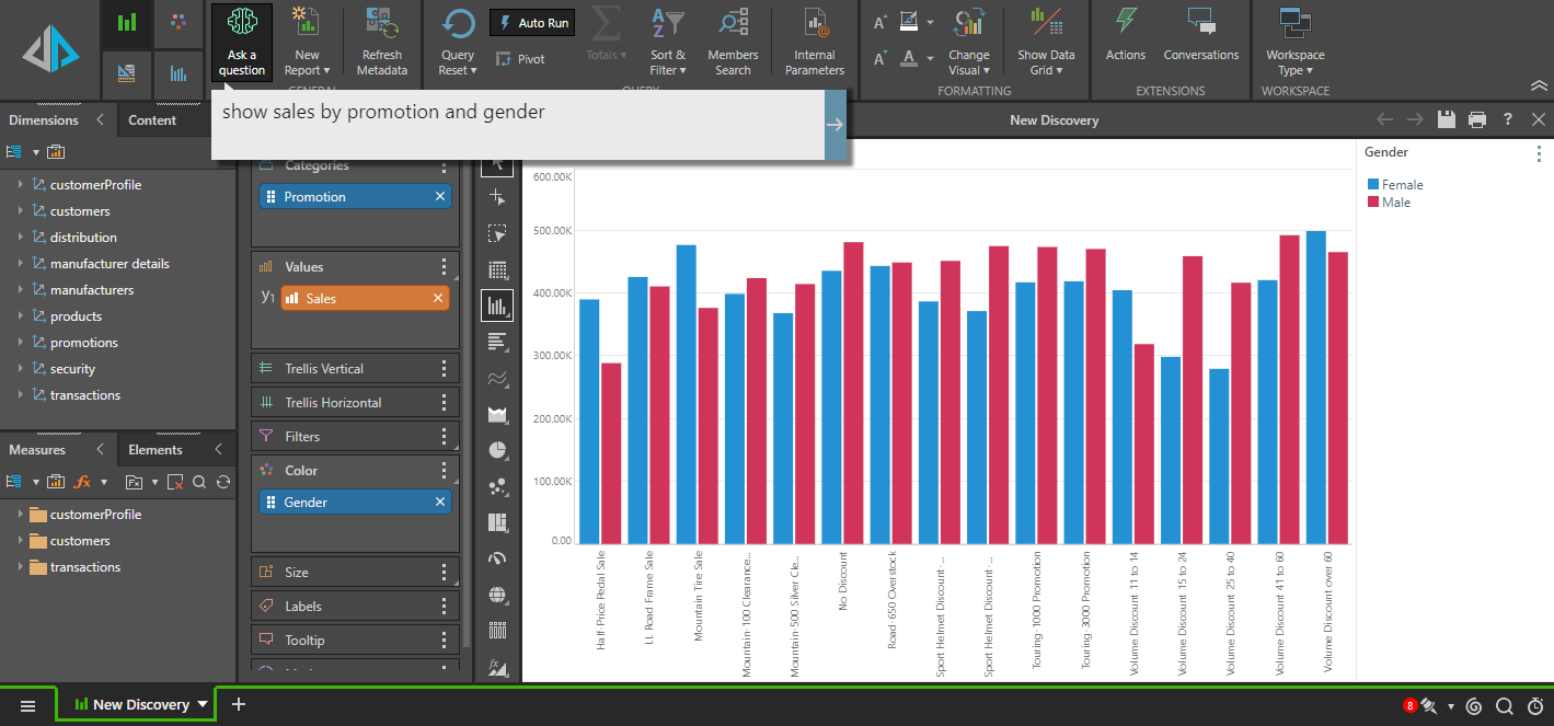
Notice, that the visualization engine determined that the best layout, for the data and visual selected was to plot the Promotions as the category axis and use Gender to drive the series (legend).
Changing the question to include the grid visualization "show sales by promotion and gender in a grid", the result is changed to:
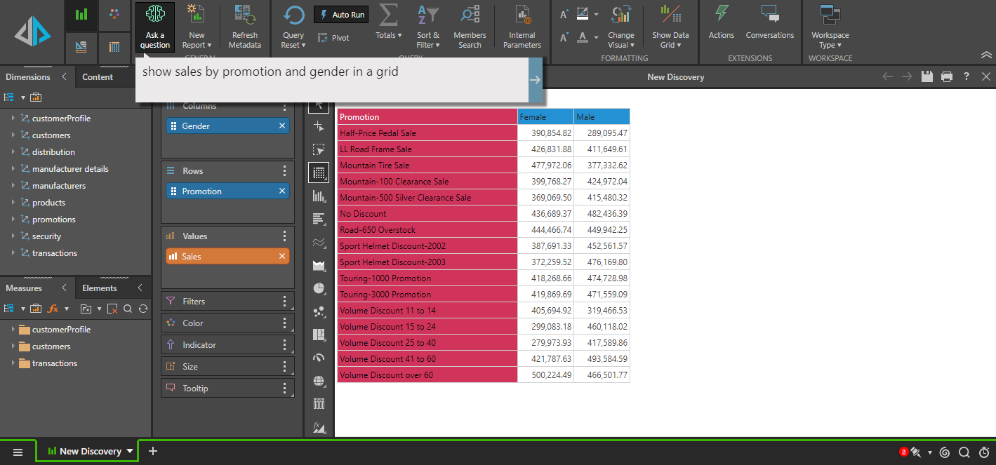
Notice, that the visualization engine determined that the best layout, for the data and visual selected was to plot the grid columns using Gender, and use Promotion to drive the rows.
While changing the question to include the pie visualization "show sales by promotion and gender in a pie", the result is changed to:

Notice, that the visualization engine determined that the best layout, for the data and visual selected was to trellis the chart using Gender, and use Promotion to drive the legend.